Best Kit Ever?

What is the best pro team kit ever? I’m talking team kit only, not a leader’s jersey, national team jersey or the national champion jersey. Not the worst either, for those are legion and worthy of a much longer article than this. @wiscot and I exchanged emails about Urs Freuler and the fantastic Atala kit which led to quick discussion of best kits. He threw out Skil Shimano and La Vie Clair as kits to consider. It’s hard to disassociate the kit from the rider. Maybe the Orange Molteni kit would be rubbish if Lord Merckx didn’t own it for years. It’s also hard to come up with a great modern kit: too many sponsors, too much sublimation. Were wool kits nicer? Maybe they were in their simplicity, maybe more iconic. Sky’s kit was a excellent change for it’s uncluttered design and in years to come we may look back on it with as much admiration as we do a Molteni kit. But since that reedy weed Froome killed my VSP hopes recently, that jersey is dead to me, forever.
Here are a few nice ones. I’m sure I’ve left many nicer ones out. Let the arguing begin.
- Atala-I know my love of the Atala prisoner jersey is bolstered by Urs Freuler’s ‘stach and a young Gianni Bugno in the stripes. The design was a nod to the early Atala frames made in an Italian prison by real Italian prisoners. It’s a damn good looking, especially when it made the transition to lycra.
- Molteni-I can’t separate the jersey from Merckx. It’s a weird color and a nice design but without Eddie’s head sticking out of the top I’m not sure it would go far.
- TI Raleigh-So much ass was kicked by riders in this jersey it was like a black leather jacket. If three guys in this jersey ride up next to you, it’s sweatin’ time. The design didn’t change season to season. Red, yellow and black: a very distinctive kit but the best kit?
- Skil Shimano – If Sean Kelly didn’t wear this kit it wouldn’t be in the running. But Sean Kelly killing it in the red, white and blue Skil kit, he makes it look awesome.
- Brooklyn Chewing Gum – This kit may have stood on it’s own. It’s original and beautiful. If Roger de Vlaeminck hadn’t rocked that jersey in various Paris-Roubaix wins it may have stood on its own but it would not have stood so tall.
- La Vie Claire – Hinault never looked quite menacing enough in this Mondrian inspired jersey. He looked mean all the time but this jersey made him look too sophisticated, someone who actually cared about design instead of just ripping legs off.
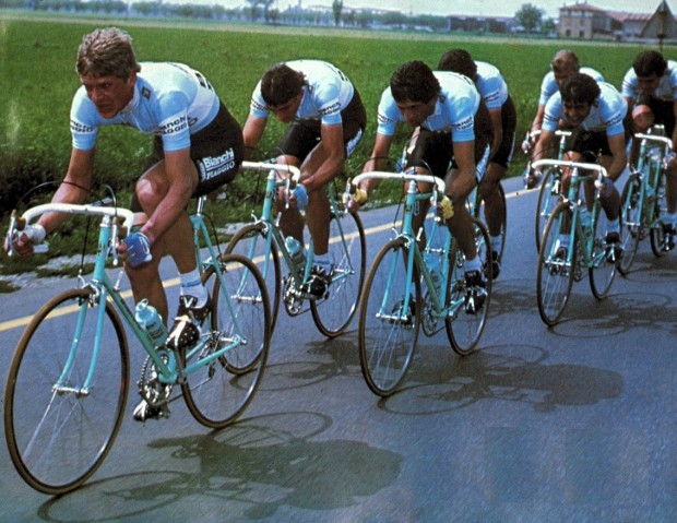
- Bianchi – Like Atala, the bike manufacturer as sponsor keeps the kit simple. Bianchi’s beautiful color and simple design really do it for me. When Bianchi again sponsored a team and big Jan was the captain, everyone won.
[dmalbum path=”/velominati.com/content/Photo Galleries/j.andrews3@comcast.net/Best Kit Ever/”/]


Currently this is my favorite kit, other than the V kit.
@Ron
It is one piece of leather, that is the seam.
@scaler911
Yeah you guys have a pretty good kit considering it was “hastily put together”, looks a lot better than most of the ones I see!
This is my favorite local kit, I really love the colors and graphics. Wish it wasn’t for a team so I could buy and wear it.
Oops, that didn’t work, let’s try that again:
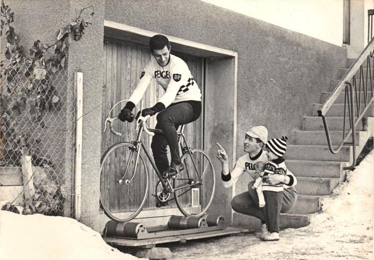
My vote is split between the Peugeot BP and La Vie Clair.
I think on balance the Peugeot. That checkerboard motif is brilliant – use it anywhere and it will still associate the brand. And so simple, using black and white. I have a merino version of the Peugeot – the only bit of pro-replica kit I own.
La Vie Clair was good too but the more derivative nature puts it in second place. After that maybe Bianchi.
@Scaler911 There’s a sort of superman underpants-over-shorts aesthetic going on there don’t you think, or is it just me ?
Hitachi
Del Tongo
7-11
This is the one local club that I have been able to find that exists, but I can’t figure out any way to get in touch with them. (I don’t do the facebooks) I like the overall look, but the font not so much.
Haven’t read through the responses yet, but I’m assuming the consensus is that this is the best kit ever.
WOW! This has brought out a lot of the lurkers, “4” posters. Great article. For the most part all great team kits.
@Dan_R Yeah, @myself. I fucking love this one more than I thought
@ChrisO
That would be one of the refinements I’m talking about.
Ha ha ha Frank! Nice post! Yes, that’s the definite consensus.
As a voice of reason I’d like to say that I think folks need to take a good look in the mirror and be honest with themselves and the rest of us; there is a distinct difference between “the best kit ever” and “your favorite kit that reminds you of your youth and your first views of the PRO peloton.”
@Oli
Lookin’ good, Oli!!
I just want to go on record that any Mapei kit sucks. Just awful and ugly. Looks like someone puked in technicolor all over bibs and jersey. I know this makes me a heretic around these parts but I can’t help it. Yes, I said II llked the AG2R kit but you have to give them credit for using brown in a good ay – unlike Footon whatever hey were called. That is in the running for worst kit ever.
I shall now duck and run for cover.
@Adrian
i suppose my taste in kits is like looking for a fine wine, it takes time to come to age, so yes, not many just strike me as ‘awesome’
I actually did look at the RusVelo kit at colorado and thought that was a pretty well done kit, and the quickstep kit is weathering well for me
For the life of me though, why Vancosoliel went with their kits, and ride Bianchi…and…well…not have the 2 in marriage just seems wrong
And who really gives a flip about Leopard other than Jens and Spartacus are there…is Devolder now?
just rambling at this point….out
@wiscot
I don’t like the bibs so much, but I really like the AG2R jersey pattern. If only they’d get black bibs. Or even blue and white bibs, with tiny brown side panels or something.
@ChrisO Derivative of what? Mondrian’s work?
@Ron Hear, hear!
@Ron Cheers, mate. :blush:
@wiscot I agree entirely, I think the kindest thing you can say about the various Mapei kits is that they are distinctive. I love the kit, and own a fair bit of it, but it’s goddam ugly as shit.
@mcsqueak
EErk! Not quite to my taste, but as a rule of thumb if people feel like they need to look up your team name on urban dictionary, you should get a new team name.
@Oli
I have a set of Mondrian style coffee cups.
A also love lamp.
And agree with the comments about Mapei. It’s probably the hardest kit to pull off, if you’re even slightly out of shape it looks like shit. A couple of Aussies who moved to Welly last year had full Mapei kit, and while amusing it was particularly rough to look at. If you were a tanned 56 kilo 6’2 Italian, it’d probably look awesome. Pasty 90 kilo Aussie? eeehhhhhhh.
I’m also particularly uninspired by the local team/shop kits, which is a bit of a nuisance cosI haven’t bought new kit for 2 years. On the upside, I had my last day at work on Friday and am now gainfully unemployed so probably won’t be worrying about team kit for a while.
@Souleur
maybe our kids will look back on the kits of today the same way we look back at the kits of yesteryear. Fine by me as long as they don’t pine over the Lampre kit……
@Souleur
Completely agree with you vacans comment….
@minion
Heh, I actually thought it was neat that it wasn’t named after a sponsor’s business, the usual naming convention.
@mcsqueak
True, I think rusty switchblade is currently the only two word combo featuring ‘rusty’ without an urban dictionary entry. What was the team kit that featured unicorns?
Team Super Awesome, I think.
It’s borderline blasphemy to consider a modern era (still in production) design when attempting to classify a kit with the G.O.A.T. badge of distinction. There’s nothing wrong with a best modern era kit design thread, but this is asking for the G.O.A.T. which is entirely different in my opinion. True, it’s hard to separate the “performance bias” when looking back at some of those classic designs, but I don’t necessarily think one should disregard that emotional connection when making their choice(s). I believe a kit that is G.O.A.T. Worthy must have that design-legendary performance-rider connection. A kit can be great on it’s own of course, but it becomes legendary and G.O.A.T Worthy only after it’s been ridden to glory by the heros of the professional peloton. Only after it’s been glorified via relentless sacrifice, competitive drama, ridden to victory, and retired into the professional peloton hall of fame.
My choice for G.O.A.T. Kit is…
1. Bianchi
High Honorable Mentions (in no particular order) include Mercatone-Uno (TdF version), Renault-Elf, Peugeot-Michelin, Raleigh, BIC, Molteni, and 7-11… all of these stand together as ultra-baddass kits!
@wiscot
My post of Footon Sevetto was, how shall we say, ummm , definately tongue in cheek ….. Ugliest Kit I have even seen…. pity ….. cause their bikes rocked.
I wouldn’t go around saying you don’t like the Molteni kit in Sydney…
Best (winter) base layers for cycling by BikeRadar, March 2012
GORE
@Oli
Yes. When I see that kit I think of Mondrian. When I see the Peugeot kit I think of Tom Simpson.
Wow, what a nice Sunday morning – got to watch the TTT WC, then the end of the Tour of Britain. Nice long “sprint” from Cavendish. Ha, just him and Eisel with over 2 km to go. Nice work.
Cool and rainy here, going to head out for some cross riding and muck it up!
Hope everyone is having a boss weekend!
@Oli
Is that a sublimated campagnolo badge? Very nice. Irish colors on the sleeve? All Black colors wouldn’t stand out on the sleeves. Well done, it is a good looking design.
Gentlemen, be upstanding for The V.
Im addicted to woollen jerseys and have the Cinzano, Wiels and Molteni short sleeved jerseys. Never wear the Molteni but over this last Winter got a Soigneur long sleeve done in black with our headtube logo. Black very slimming – just what you need over Winter.
7-11, Brooklyn, and Molteni are probably my favorites. I also think the current Farnese Vini kit is prety cool.
@Gianni Italian colours! To reflect my heritage…to be fair the red does look somewhat orange in this pic, but I assure you IRL it is vividly red, as per the tricolari.
And that is indeed the 70s Campagnolo rondel, which I was lucky enough to be given permission to use on all my kit.
spooky?
@Oli
whew, it sure looked orange. Tricolari and the Campa rondel. It gets my Gianni stamp-o-approval.That’s so cool. Available to the public at oli.com?
@Ron
The Giro gloves have held up reasonably well. They are getting a bit dingy & I need to clean them but otherwise no complaints. If they get wet you obviously need to dry them properly or they’ll mold.
@jimmy
Bullshit. No way those wheels stood up to so much weight.
How about fictional jerseys? Anyone know where I can find a blue Cycles Goff retro wool jersey?
This
Bianchi definitely gets my vote
Did Bianchi invent blue, or their shade of it anyway? – is it actually called Bianchi Blue? – never seen it called that anywhere, but maybe no-one else can recreate it in it’s purest Bianchiness?
@Dr C
The Hitch Hikers Guide has this to say:
“Bianchi bicycles are traditionally painted Celeste (pronounced che-les-te in Italian, Se-lest in English), a turquoise also known as Bianchi Green, (and sometimes, incorrectly Tiffany Blue, a copyrighted colour). Contradictory myths say Celeste is the colour of the Milan sky, the eye colour of a former queen of Italy for whom Edoardo Bianchi made a bicycle (the crowned eagle of the company logo is an adaptation of the former royal crest) and that it was a mixture of surplus military paint. The shade has changed over the years, sometimes more blue, then more green.”
fuckity fuck fuck
Local kits around Alberta have really gone clean and retro (a good thing), but I show up at a race last year and a club is sporting MY FUCKING design for my bike studio gear. And then, my own former club shows up with my replacement 6 Day look! OK, let’s go with a nod to Peugeot look with a bit of checkered flag – nope a Calgary club has got that already “new” fucking design…
Fuck me with a crucifix.
@the Engine
thank you, I have no further enquiries on the matter
Best lack of kit?!
@the Engine
My memory is that Bianchi ran adverts in Winning Magazine in the mis 80’s asking for public opinion as to whether Celeste should become thier trademark colour. Oli, do you recall this as well?
@sthilzy
@mouse Yes I do, but they were asking if it should stay their trademark colour.
Two of the best kits ever (one with more than a hint of Bianchi influence).
@Marcus
I am converted….this gets my vote!
@Gianni – Saw this and thought of you. (Not for wearing, of course…)