Team USA: Doomed From The Start
The Road Cycling World Championships are on our doorstep. The USA is hosting, which makes me nervous immediately. How can we fuck this up? Ask Taylor Phinney for starters. This event has not been hosted by the USA since Moreno Argentin won in Colorado almost thirty years ago. We just don’t have the experience to pull off cycling events of this importance. The police are used to impeding cyclists, not protecting them.
But the Americans can’t win either the women’s or men’s road races simply because of the awful kit they have to wear. All V will be drained by the lameness of the jersey. The Rainbow Jersey would refuse to even slip on over such an abomination. Back in the day, Greg LeMan wore the Captain America jersey and won the World Championship at age 22. Going into the worlds as Captain America is a lot more powerful than whatever the hell this new design is. FFS, give these riders a chance. Representing your country in the World Championship should be a highlight of any cyclist’s career.
The Belgians, the Aussies, the Italians, The French: they all have jerseys that say we are here as a select, badass team and we are going to fuck you up. The American’s look like a trade team for a car dealership. It hurts. The Spanish might be in trouble too by the look of last year’s design and the fact they generally refuse to work at crunch time.
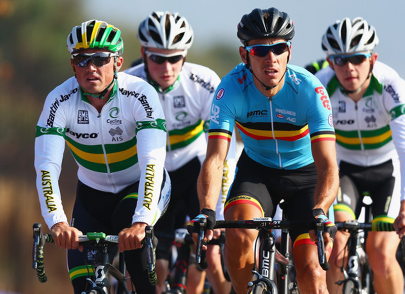
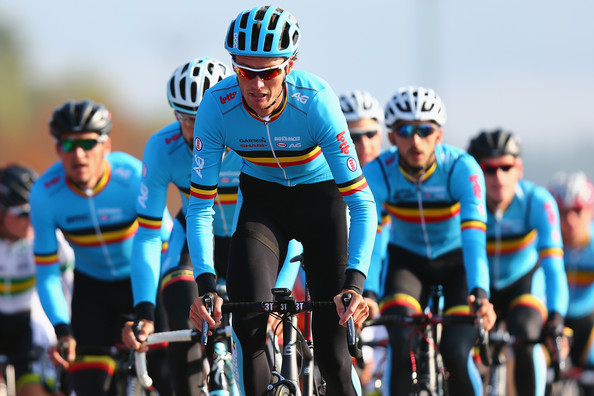
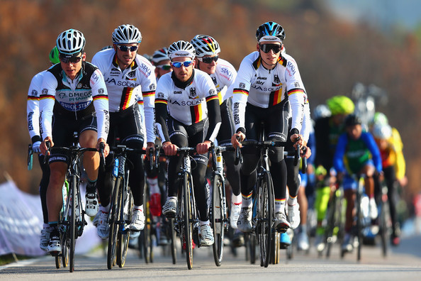
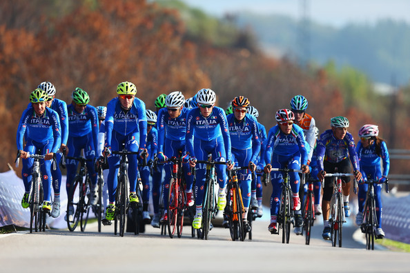

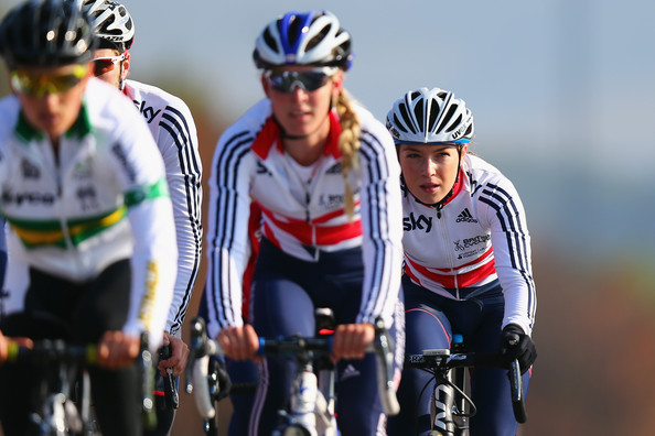
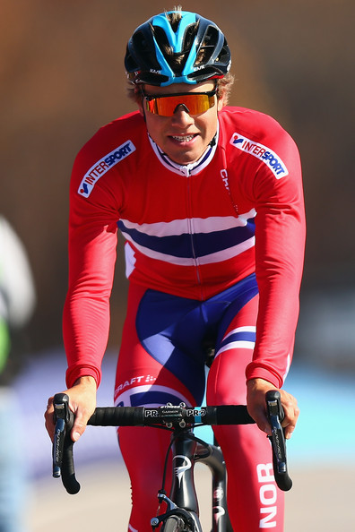


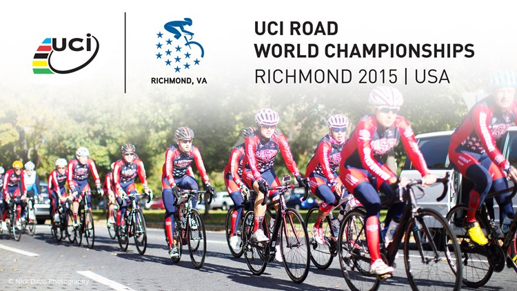




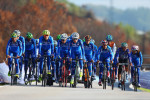





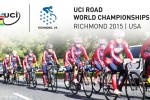

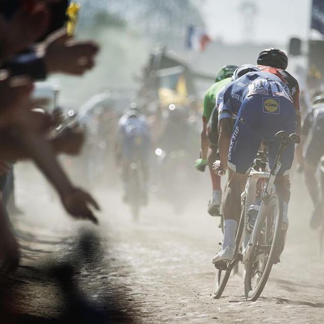
Our club kit is an exact copy of the Belgian team jersey. In fact it was one of the reasons I joined them. Mind you I won’t tell you the name of the club, or even the country, lest we get a ‘cease and desist’ letter from the Belgian Cycling Fed’!
Does the US kit come with a handgun holster and place to put your beef jerky chewing tobacco?
Belgium is, of course, the standard bearer.
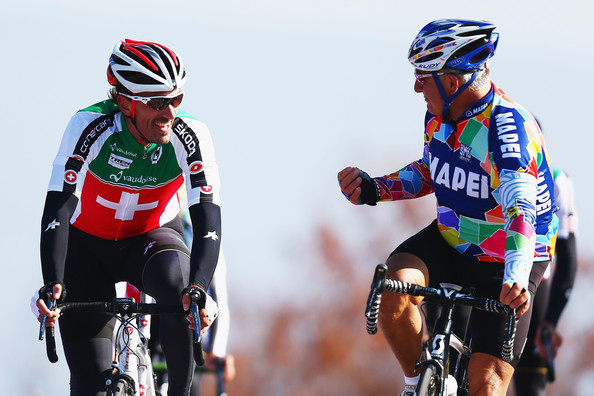
Spain, Switzerland and Australia are all pretty crappy. Why has Switzerland have green on it?
NZ, well you can’t go wrong with black. There’s a referendum about to go down here for changing the national flag, which I’m all for. Australia needs to change too, they both look the same and are pretty much a Union Jack with a few stars chucked on.
What amazes me is, every NZ sporting team wears either black (or white) with a Silver Fern logo, yet people are crying foul because a couple of the flag designs have a bloody fern on them! The same people who’ll go to the rugby/cricket/Keepers Tour and wave a fucking black/silver fern flag.
Quite a few laughable (the good way) bits in there, @Gianni. I think the Belgian kit is the finest of them all. Just look at Lotto Soudal. And those Ridleys, me oh my. Leave it to the Belgians to come correct.
The USA is stuck in the “more is better” mindset. Two year election campaigns, big coffees, bigger meal servings, more guns, money and cars. Their jersey designs celebrate this excess. All the colours, all the stars, all the words.
– = + (less is more) ssshhhhh.
Lead photo AOP. Phil Gil thinks it’s summer, looks Fantastic. Gerro thinks it’s winter, looks 2 fat 2 climb.
Wow. That is terrible.
While not nearly as “fugly” as the USA Kit, Canada’s kit appears to lack any distinguishing features. At least the bottoms are Rules compliant.
http://www.cyclingcanada.ca/sport/road/news/cycling-canada-announces-road-world-championships-team/
The should have stuck with the Pan-Am kit.
http://www.louisgarneau.com/img/thm/t495_SlidePanAm_B2C_Eng.jpg
@Matt
The Belgian kit is, as far as I know, unchanged since the Merckx era. It has always looked fantastic. Eddy having won in it didn’t hurt.
The Italian one, all blue, it very classy and understated for the Italians. They might have gone for some over the top white, green and red mash up.
@Harminator
The designer of the USA kit can’t be a cyclist. It must be some fucking advertising person who is worried about the USA brand. Grrrrrr. Where are my pills?
@DeKerr
USA needs a Canadian, specifically, Winnipeg Cycle Chick to design some USA kit in the future. Man do we need a change.
@Harminator
Let’s make no mistake: big coffees, meal servings, more guns, money and cars are in fact all better. More bikes and guitars too.
When it comes to kits and jersey’s only one question needs to be asked, Does the jersey look good with black shorts? If yes, then in all likelihood, the kit is fine. In the case of the USA jersey, uhhhh, no, it would not. I’m with @Gianni in this instance. Yuck.
@Gianni
That’s it! You’re right about that. An advert person worrying about branding. It’s the same fugly sh** with recent Olympic kits yes? Seriously? WTF?
So why exactly can’t we keep the “Captain America” kit from year to year? At the very least perhaps let the La Vie Claire lady design it. She has some good sense.
USA kit looks like one of those travelling American freestyle basket team set to tour across the country this summer to a shopping centre carpark near you. Spain, like a cross between a Jelly Belly and Kool Aid Jug dude.. “Oh yeah!!”
This is a true low point for us Americans, even the Canadians are making fun of our kit.
“Oh God.”
Ahahahaha! Gianni, you never fail to make me laugh, mate.
@brett
I love the All Blacks but I don’t want their logo as my national emblem.
The British kit is OK-ish. Certainly heaps better than it used to be, but then again
seems that having a crappy kit isn’t always a barrier to success.
(noting that he’s out this year after doing something I did earlier this year. Bruised rib cage sucks badly. Literally. You go to breathe in hard and can’t, because some arse is stabbing you with much pain. Dropped by club rides thanks to that)
Eh, to look good is to already go faster, but to look terrible is to already work harder. Maybe we’ll pull this one out.
Nice wrap up @gianni, Gerrans looking like an Australian gorilla, be nice to see him get a win, but had a crap year…… I think the Spanish armada kit is the worst of the crop..maybe its part of the strategy to freak out the other teams and make them throw up?
Wait – I thought the USA kits were the Captain America kits again? I’m confused, do we suck or do we rule? Is this just a retro replica kit with the 2015 logo being sold in Richmond? I have a headache.
The Captain America kit was so awesome, and can I please also note that back then they also wore their regular team bibs, which was such a cool mis-matched look. For reference:
Also, that Spanish kit is a fucking nightmare. Worse than the US, I’d say.
After seeing LeMan’s WC’s, I always thought said kit would be the Status Quo for USA;
@Harminator
Gerro has just finished the Vuelta, so I don’t understand what is going on there.
PhilG looks very lean.
Re: the British Kit and Rapha – does anyone else remember the terrible Adidas cycling they ran in magazines? Guys who looked like they’d never been on a bike, with hairy legs.
@Gianni
The Belgian kit today and for the last years have been like the Merckx one. Brilliant. But in 1996 when Museeuw won the World Championship in Lugano the Belgian kit looked like this:
https://s-media-cache-ak0.pinimg.com/736x/91/5f/89/915f8931151bafecc052a66ad4769adf.jpg
He kind of made up for the ugly jersey by riding a Mapei Colnago C-40 with Lightweight wheels though…
Do I note correctly that the USA kits look to be the only kit w/o a sponsor name slapped on them?
@wilburrox
never mind… I think I see sponsors on ’em
I saw that, and went ‘Oooooof’. Not good. And as an aside, I think the Spanish kit could indeed do with a bit of work. Red with a yellow band? Simple and effective?
@Harminator
Outside of Belgium, it’s always summer.
@sthilzy
Rebecca Twigg, the focus of my first pant-busting crush.
Not the best looking kit. Considering Talansky was looking pretty sharp in his national TT jersey at the Tour this year.
http://cdn.media.cyclingnews.com/2015/07/04/2/pic544822362_670.jpg
@frank
Ohh..if that’s the case can I assume you have this poster up somewhere like I still do?
@frank
She was/is a hoss. In the late 80’s I was on a training ride with her and had to hang on for dear life when she put the hammer down (to drop some assholes who thought it cute to pinch her on the backside). Merckxy-me she’s fast.
Two TT teams have had bad crashes because of potholes on the course. American infrastructure at its best. It would have taken too much thought and effort to fix that kind of thing before hand. This is why I rant.
@Neil
Glasgow Nightingale?
@Haldy
My eyesight is fading – I thought it said “minge” on those helmets
@The Engine
To offer you some support – I thought exactly the same thing and was about to post to say so.
@Gianni
FFS, I can’t believe you guys didn’t re-lay the entire TT course, it’s only 38km, not the road race course mind, a variety of surfaces is more than acceptable in road racing, but make TT’s all about speed.
@The Engine
@RobSandy
Who is the blond minge amongst the helmets?
@Oli
You might be shit out of luck there mate…
Surely it’s more than an All Blacks logo though? Anything but a fucking Union Jack.
@Gianni
Is that seriously a question? It is Rebecca Twigg. The same gal from the pic that @frank posted. 6 time World Pursuit Champion, 2 time Olympic Medalist, and 16 times National Champion. She earned her sixth title at the Worlds in Bogota and set a world record in the event…3 weeks after breaking her collarbone in training. Now that’s a healthy dose of Rule #5!
Cheer up y’all. At least the US cycling team all wear the same kit. Something that cannot be said of the US skiteam with Vonn vs Mancuso.
@brett
Being half-English I don’t mind the Union Jack at all. Pretty sure my 3rd generation Kiwi Grandfather who fought in WW2 wouldn’t want the old flag abolished either. I say we wait until we actually become a republic before we change flags. The whole thing is fucked up.
@Oli
My mother is English, so I guess I’m half-English too. Bring on the republic.
@Frolle
…and by being Museeuw.
@brett
But then Emporer Donkey will enslave the rebel alliance with a clone army? Oh, wait…
As for the US kit, all I have for you is sparklestarclusterfuck.
It looks like someone just threw (up) some red white and blue paint on a jersey.
@Haldy
I knew it was, I was making sure I used the words “minge or minging” in a sentence everyday. It’s part of my effort to broaden my horizons.
@Gianni
I am quite relieved to hear that!
@Ccos
The La Vie Claire “lady” was Dutch artist Piet Mondrian (1872-1944). Still one of the greatest jerseys of ALL time.
Agree 100% with Gianni. USA kits since LeMond have been execrable. Look to Belgium – if it ain’t broke, don’t fix it. Britain could do much worse (and have) since they abandoned the classic blue body/red sleeves jersey of the 70s/80s.
I’m not affiliated with a club at the moment – mostly because I like to ride alone, partly because most local club jerseys are hideous. Sublimatic printing has an awful lot to answer for IMHO. My last club in Scotland? VC d’Or. Our jersey? The Dutch champions jersey. Wore it yesterday for almost 200kms. Still sharp after 26 years.
@Gianni Team Spain and Team USA. No chance – WTF kit fail