When Kits Were Cool
 The modern day Pro cyclist has many disadvantages stacked against them by comparison to their forefathers. They have to ride plastic bikes with little or no distinguishing character or discernible caché; they must willingly or perhaps unwittingly subject their body to an array of questionable “training techniques”; and they have to spend every waking hour poncing around in public wearing gaudily coloured outfits plastered with a myriad of logos, half of them (thankfully) not even readable. No one wants to be a the face of gastric reflux relief, no matter how glamourous it sounds.
How they must wish they were born long ago, in a simpler time, when bikes were made by artisans, not robots, and they were shiny and classy, much like the automobiles of the same era. When the only substances they need ingest came from a decanter, and they could enjoy a quiet smoke along with their tipple. And they certainly long to be able to wear a long trenchcoat and Aviators on the way to the podium, or a crisp single-breasted suit with a smart Trilby, perfect attire for lounging after winning a Classic, or attending a Gentleman’s Club, rather than wrapped in nylon and dipped head to toe in fluoro paint and topped off with something more commonly seen at Yankee Stadium.
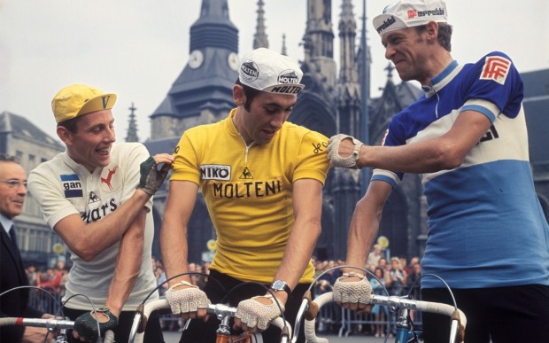
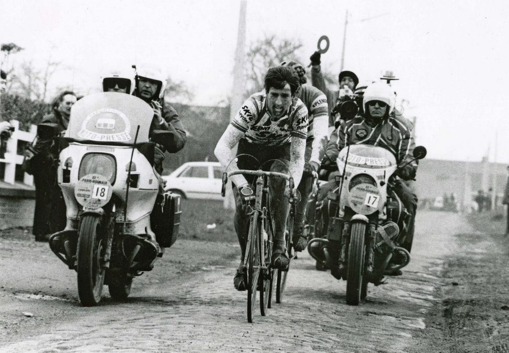
Just look at these pillars of style. They never had to fear the beginning of the season, when their DS would toss them a few plastic bags and tell them “this is what we wear this year.” They knew exactly what they were getting; solid colours, no fancy fonts, the main sponsor easily read in bold lettering, and black fucking shorts. There was no apprehension when moving to a new team about what hue of pink or aqua or yellow they would be subjected to. They knew hey were going to Look Fantastic.
Unless, of course, they’d signed for Atala.
[dmalbum path=”/velominati.com/content/Photo Galleries/brettok@velominati.com/old kit/”/]


@fignons barber
You know, it just has to be reiterated: kits WERE better back then.Not crazy about the chest pockets, but from a design point of view, flawless.
@wiscot
Absolutely. In anticipation of the cooler weather, I just popped for one of these over at Prendas:
@sthilzy
The apogee of Badass. Anquetil looks pretty strong for someone four months from death by cancer.
This.
Designed by a man, surely: http://www.theguardian.com/fashion/2014/sep/15/colombia-womens-cycling-team-stylewatch
Not cool, not cool at all.
@wiscot
Apparently not – designed by one of the women in the team.
http://road.cc/content/news/130260-brian-cookson-says-uci-case-over-colombian-womens-team-kit
@ChrisO
Still a bad call IMHO. Love how Cookson put OBE after his twitter name. But hey, he’s “on the case” so we can all sleep easy tonight.
I will take any excuse to upload this pic .Andy Hampsten, Giro TT. Simplicity skin suit with obligatory lead sponsor logo but nothing else. Fan Fucking Tastic!!
Sorry guys, unable to upload
@gilly
No excuse needed. Always an ace picture. No stupid-looking pink shoe covers or pink gloves, or pink helmet or pink anything except the maglia rosa. Ahhhh . . . those were the days.
@Chris