In Memoriam: The Tricolore

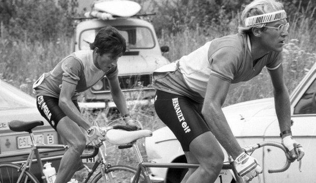
It was a simple time. Team kit was understated, with black shorts and a few colored panels on the jersey. Race Leader and National Championship jerseys were plain, and often even lacking in the name of the sponsor. National Championship jerseys in particular were a matter of national pride more than sponsorship; it was an honor to fly the colors of your country in a jersey that payed homage not to the team’s branding, but to that of the nation’s flag. The jersey was worn with standard team kit, often in garish contrast to the colors of the sponsor. It was gloriously Casually Deliberate.
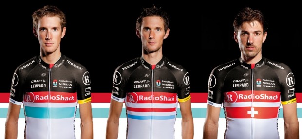
Then, as more money came to be at stake and the sponsors became ever more loosely tied to Cycling’s history, it started to change. First with the shorts, which were modified to match the jersey, either with different accent colors or with an entirely matched design. Then teams started discouraging their riders from winning national championships and, if left no choice in the matter, they chose a design which matched the standard team kit design as closely as possible in order to maximize sponsorship investment.
The first time I noticed this trend was an account from Roger Hammond, the reigning British Road Champion, who had just signed with Discovery Channel. It was a matter of pride for him, of course, to wear the jersey but his new sponsor was not so keen and certainly held no special respect for the history of his jersey. After all, a national championship jersey has very little room on it for Discovery’s branding, and that meant a smaller return on their investment in the rider as a billboard. If I remember correctly, he was strongly discouraged – if not barred – from entering the race.
The Tricolore jersey is my favorite of any jersey available. If I were a Pro, I would carry a Dutch and not American license for no other reason than for the chance to race in the red, white, and blue stripes of the Dutch flag as opposed to the vertical stripes and star-spangled design of the American flag (however cool that jersey is as well).
To declare this In Memoriam is perhaps premature, but we are moving inexorably away from this glorious jumper; shorts are too often matched, bicycles too often repainted. I have nothing against maximizing a sponsor’s investment, but I worry over the consequences. I worry for the loss of standard team shorts, standard team kit, and the tricolore jersey. Will all teams follow Team Radiosanschelck?


How does it work?
Do each team at say le tour have yellow, polka dot, white and green jerseys made up in the team bus in case one of their team rides well enough to wear it (in various sizes) or do the race organisers do them?
@snoov
I think they are made up quickly overnight, they just throw a fake one on for the podium. At least that is what one tour did according to an article I read, something about portable sublimation.
@snoov
Race organizers do the ones for the presentation (they have a van with jerseys and team logos to transfer on to them dependent on winner). Dunno about how they organize the actual ones to be worn next day
They sublimate the podium ones while the riders are getting cleaned up and getting on the podium – at least on the Tour. I’d imagine sublimating a few overnight for the following day wouldn’t be a problem at all for the race organisation, and it’s up to the Team to organise all the matching kerfuffle…
Great photos, @frank!
@frank

Could’ve been a Fignon thing, or they maybe couldn’t find an iron until the finish in Milan.
Here’s Visentini in 85, fully branded. That chick behind him in white is really grooving on his bottom bracket.

But to your point, I think the bands with an alternate background (N’team) is more ideal for a V-kit than 3 large bands the length of the jersey (champion). Of course given your heritage that background should be orange instead of light blue.

The Canadian National team kit was blue for a few years – christ on a hockey stick that was fugly.
In 08 they finally sorted that out to a degree going with red, black on white.
And it is an easy workin for any team, just throw a red maple leaf on somewhere and its done
@jimmy
I can only imagine the hilarity of this, knowing the Lion King:
http://www.mcipollinigiordanateam.com/detmultimedia3.php?id=31&idup=11&ANAR=
@DerHoggz
tell you what, if there was someone I’d happily pay to give cycling/life lessons it would be the Lion King. The man just oozes style on & off the bike
@DerHoggz
The only dude that oozes more stud than that dude is Robert Plant circa 1978.
Msytped form my iphine
What two Markos?
@Marko
There I was thinking @frank had demoted you for trying to get the vintage jersey thing off the ground while he was stuck in transit.
Bike Snob NYC eloquently sums up the Cipollini training camp.
http://bikesnobnyc.blogspot.com/2012/03/conquests-another-notch-in-belt.html
Has anyone ever read Cipo’s twitter?
@DerHoggz
F’n awesome! I’m sitting across from the VMH laughing, and she thinks I’m crazy because I can’t explain what’s so funny about it. If I had any say in it, I’d give you the +1 badge myself.
@scaler911
Seconded for the V Badge, that had me giggling like a schoolgirl & all my colleagues wondering why I’d gone nuts.
@DerHoggz
Brilliant! All the women have a “can we finally ride?” look on their faces.
@DerHoggz
“My team’s bike sponsor gave me an STD.”
Nipple Lube.
@DerHoggz
Brilliant.
Couldn’t help myself, what with all this talk of tricolore jerseys. This is one modern example of how it should be done.
@jimmy
I’m not groovin’ on the Brooklyn ripoff (sorry guys) and the throwback jersey is a very difficult thing to call. It has to be completely original but totally old school at the same time. Very hard to do. I think the guiding principle is what could you do with the technology of the day (i.e. sewing panels together) and design it based on those principles.
But to do it in modern materials seems half-cocked to me. Why are you doing it? Its just a gimmick then, kind of like designing the calendar app on the Apple to look like a notebook; you’re using cloud technology to sync your calendar across dozens of devices in realtime and then making it look like a notepad with poorly-torn pages. Its idiotic.
I’m all about looking the part, but I’m all about authenticity as well. I would be much more inclined to leave our modern jerseys as they are, but have an authentic wool jersey made in an oldschool design. You want a throwback jersey? Do it for real and go wool. two colors. Orange in a panel across the shoulders and to just above the breast, and then a black trunk. The Velominati logo sewn across the chest.
@scaler911
Done. And, DerrHoggz likely lucks out now too as I’ll forget to change it after a week and he’ll get it until I get back from Belgium and I go, “WTF?”
@il ciclista medio
Not a big fan of GreenEdge so far, but their kit is glorious, and this particular nat jersey is, from what I can tell, totally standard and so are his bibs. Its all class, that.
@frank
That’s actually a much cooler idea.
@frank
Heh, you go away for 12 hours and the inmates start running the asylum!
@DerHoggz
The sacrifices Mario makes for his team are incredible. Watching young ladies stretch, riding behind them, “helping” them with their positions. Such a hard job!
Not 100% related, but very interesting blog on INRNG about how the Olympic sponsorship rules will govern cyclists during the Games and, quite possibly, surrounding races. Worth a read.
@frank
Pretty much what I had suggested but witha grey stripe on the bottom. Make it a Velominati national TRi color. Wool being the way to go.
@frank
and that’s why he runs the show…completely agree. The other designs were cool, but if we do it, it should be done right.
@jimmy
Awesome!
@frank
+1, I like the idea of a distinctive retro woolie. Lot of effort has gone into the current v kit design. Wear it with pride and keep throwing down some V. Good luck w/ the ride this week.
Just to throw another woolly dimension into this jersey discussion… are we talking retro wool or modern wool ?
The stuff that Rapha and others do is a mix of wool and synthetics and in the lighter versions is just as comfortable and cool as any lycra jersey (I have a couple in Abu Dhabi). It also has the advantage of being something you can chuck in the was with everything else.
Or is the intention to have a real traditional wool, the type that has to be dried flat, and would probably be more of a casual item ? I have a Peugeot jersey like that, which is very nice but I tend not to wear it that much because it is high-maintenance.
@Chris
you lost the O mate!
@Chris, @RedRanger
It’s going to be confusing enough over the next few days on tour with there being two of us about. Maybe I should borrow you avatar to really mess things up.
@frank
+1 Frank. I am in for a woolen old school jersey. Short and longs sleeve versions would be fantastic.
QuickStep’s national champions jerseys have been the best in the peloton for the past few years.
Tricolour helmet (BMC/BELL image) nice
Saw this photospread at velonews and thought I’d post it up: http://velonews.competitor.com/2012/06/news/gallery-the-best-and-worst-national-champion-kits_225256
@Dan_R
Boobies FTW!
…
Sorry, my inner geek doesn’t get out very often and tends to take over from time to time.
try minecraft free noob